This is Day # 2 in the Windows 8 development article series on common tips & tricks towards developing real-world Metro apps. Over the next several weeks, you’ll see 8 articles talk about some must-do things for Windows 8 Metro app developers. Simple & to the point, with some code examples on XAML/C# stack. Here’s the indexed list for the series:
Day 1: Know the ecosystem; Start
Day 2: Layout, Navigation & Visual States
Day 3: Semantic Zoom
Day 4: Controls & Styling
Day 5: Search, Share & Settings Contracts
Day 6: Data Persistence & Application Life-Cycle Management
Day 7: Use of OData or Web Services
Day 8: Live Services integration
Day 2: Layout, Navigation & Visual States
App Layout:
So, you have the next big app idea. The real question is – will it delight the user? All Windows 8 Metro apps should and it is critically important to plan towards it. One curse for us developers is how easy it is to get started with an idea and go File->New Project in Visual Studio. As the Metro design principles stated again & again, let’s sweat the details. Pen & paper can be a wonderful companion to plan out the overall application layout. How will you slice & dice your content? Is the app content going to laid out in an information hierarchy or in a flat system? How would the app support Metro design principles & integrate with the rest of the OS?
There are two places I personally start out at. One would be OS features or other applications, to be inspired by how others have done it & then give my app it’s own brand. If on Release Preview, the Windows 8 Store is starting to get a lot of very well designed apps that should inspire. Second, are the VS project templates. Although not a good idea to start a project right away, take a peek at the templates; this tells us what some common page layouts are and helps us plan the breakdown of information in our app. Some example layouts below:
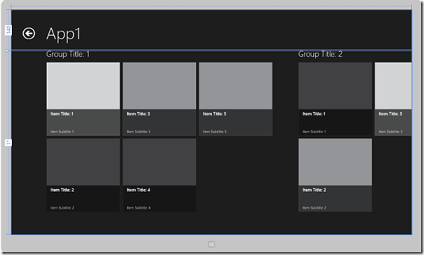
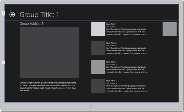
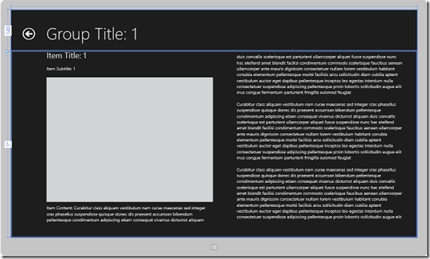
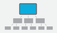
The above page templates help us see through the planning of our app: Is it going to a Hub & spoke model with Hub, Section & Detail pages? Or a Flat system of content pages with linear navigation? Your call, but chose well.
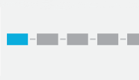
Page Layout:
Similar to Windows Phone, Windows 8 Metro apps in XAML/C# stack are made up of multiple pages. These pages are hosted inside of an Application Frame, and constitute the canvas on which we lay out the content of our Metro style apps. When a Metro app is in full mode (taking up the whole screen), edge-to-edge of the display is filled by the current application page, thus immersing the user in content. The real estate is yours to shine in or mess up  .
.
The three basic ways to lay out content in a XAML page still stay the same using the generic container Panel controls – Grid, StackPanel & Canvas. The goal is to make this container support a flexible layout system so that our app looks great in varying screen resolutions, pixel densities & orientations. So, you can see why Dynamic layout system using Grid/StackPanel is more flexible than the Absolute X-Y positioning in a Canvas.
Canvas has a distinct place & use, when we need to absolute-position controls using Canvas.Left & Canvas.Top. If there is a genuine need for absolute positioning, you may consider different pages for supporting various screen resolutions or opt for scaling.
In the dynamic layout containers, we specify child elements in terms of relative position & how they should wrap inside their parent controls. The use of auto or star sizing in control height/width inside the container is the most flexible way to auto-adjust control layout as the size of the parent container changes. Just as in any XAML UI, we lay out our controls in a Grid using RowDefinition & ColumnDefinition; while StackPanel stacks controls horizontally or vertically using the Orientation property.
Control Layout:
So, by now you have your application & page structures laid down roughly. Congratulations! Pat yourself on the back & indulge a little, since you have done the hard part. Now, what comes next isn’t hard; just take meticulous patience. What do we need to remember as we plant controls on a page inside their containers?
Turns out, basic Metro principles help. The key is to be consistent across the application; nothing should be jarring to the user. So, we’ll try to stick to a consistent Metro-inspired pattern of control margins, page headers, app bars, gutter widths and other elements to achieve unity in the app silhouette. Absolutely positively stick to the Grid, in terms of laying out text & controls:
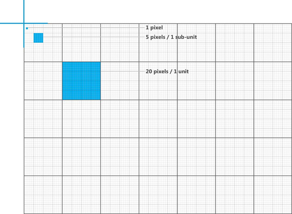
Invest in making a common Page header or App/Nav Bar user control that can be leveraged all across the app, if applicable. Content region on every page needs to strive for consistency in margin & padding of child controls.
Navigation:
Once the application ‘information architecture’ has been laid out in full, navigation between parts of the app should be natural. Content is king; so let us allow the user to use content to manipulate the view presented to him/her. This form of direct manipulation demands that navigation mechanisms be available through the content canvas itself.
Check out this little piece of code from the OnLaunched event handler in App.xaml.cs. It shows how the root Frame of the application is loaded up by the OS on app launch, followed by navigating to the first page:
1: protected override void OnLaunched(LaunchActivatedEventArgs args)
2: {
3: // Do not repeat app initialization when already running, just ensure that the window is active.
4: if (args.PreviousExecutionState == ApplicationExecutionState.Running)
5: {
6: Window.Current.Activate();
7: return;
8: }
9:
10: // Create a Frame to act as the navigation context and associate it with a SuspensionManager key.
11: var rootFrame = new Frame();
12: SuspensionManager.RegisterFrame(rootFrame, "AppFrame");
13:
14:
15: if (rootFrame.Content == null)
16: {
17: if (!rootFrame.Navigate(typeof(FirstPageClassName)))
18: {
19: throw new Exception("Failed to create initial page");
20: }
21: }
22:
23: // Place the frame in the current Window and ensure that it is active.
24: Window.Current.Content = rootFrame;
25: Window.Current.Activate();
26: }
Navigation between pages in the application frame can be very simply done like this:
1: this.Frame.Navigate(typeof(SecondPageClassName), CustomParameters);
As you can see, it is easy to carry any custom object or information from one page to another. One caveat would be that if you find yourself doing a lot of this, may be it’s time to consider using some global variables (defined in App.xaml.cs) to have consistent access to the same data across multiple pages.
There is one deviation to creating navigation elements on canvas. And that is around not recreating the wheel and integrating our app with the rest of the Windows 8 OS. The user is already used to using the App Bar & Charms bar; so why give them another way of doing the same thing?
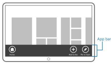
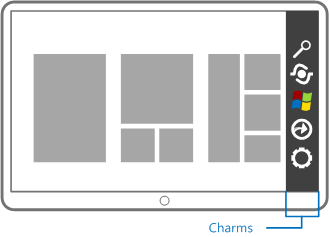
App Bar is perfect for providing context sensitive commands on a given page. It stays tucked away until the user needs to manipulate the view that he/she is on. And application features like Search, Share & Settings should absolutely utilize the app-to-app Contracts in Windows 8 through the Charms – clear, consistent & easily available on right edge swipe. Flyout & Context menus are also a great way to provide navigation hints without inadvertently acting on the user’s touch interaction.
Visual States:
While Windows 8 is meant for all types of form factors, heavy usage of touch-based Metro apps will be from tablets/slates. And that means, we app developers need to be understanding and supporting the various orientation & visual state changes for our app. Supporting orientation changes should be relatively easy if using flexible design layouts of Grid/StackPanel. If your page isn’t too busy, simply allow the controls to flip & support the new orientation; with auto sizing on, the content should flow/wrap as needed. You can select your supported orientations from the application manifest UI editor as below:

Now, as for the Visual State changes, Windows 8 has this wonderful feature of being able to run two Metro applications side by side. This is NOT an optional feature to support since Metro app users will always be able to do this; and not supporting it means we would provide a crappy UX when our app runs side by side with another application.
There are three simple visual state for a Metro application – Full, Filled & Snapped. While the names are explanatory, the image below explains the states even better. Left to right, are Full, Filled & Snapped Visual States of any given application:
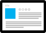
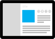
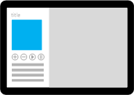
If you are using a flexible design layout & data binding through standard controls, supporting this change of visual state is not very difficult at all. And there is plenty of help from the VS generic project templates. Let’s say we were building a Windows 8 Metro app for perusing SilverlightShow article content. A listing of latest articles in Full, Filled & Snapped mode could look something like this (we would walk through the building this sample later in the series):
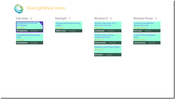
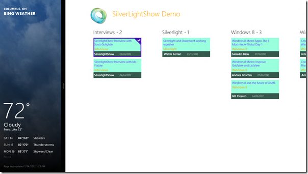
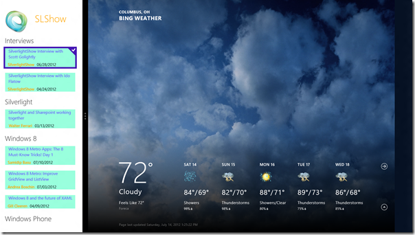
The beauty of supporting the change in Visual State is the fact that the page could retain it’s state and be bound to the same collection or object behind the scene. We only switch out the UI element that is bound to the data, to fit the much smaller width of the snapped state. The easiest way to get this done is by using one of the default project templates in Visual Studio 2012 for Metro apps. It drops a file called LayoutAwarePage in the Common folder. Inherit your pages off this & voila – you have ready-made hooks into the system events as to when the visual states change. The whole switch can be done purely in XAML using Visual State Manager. Watch how seamlessly we switch the display from a GridView to a Listview , both bound to the same list of article objects:
1: <VisualStateManager.VisualStateGroups>
2: <!-- Visual states reflect the page's view state -->
3: <VisualStateGroup>
4: <VisualState x:Name="FullScreenLandscape"/>
5: <VisualState x:Name="Filled"/>
6:
7: <VisualState x:Name="Snapped">
8: <Storyboard>
9: <ObjectAnimationUsingKeyFrames Storyboard.TargetName="itemListScrollViewer" Storyboard.TargetProperty="Visibility">
10: <DiscreteObjectKeyFrame KeyTime="0" Value="Visible"/>
11: </ObjectAnimationUsingKeyFrames>
12: <ObjectAnimationUsingKeyFrames Storyboard.TargetName="itemGridScrollViewer" Storyboard.TargetProperty="Visibility">
13: <DiscreteObjectKeyFrame KeyTime="0" Value="Collapsed"/>
14: </ObjectAnimationUsingKeyFrames>
15: <ObjectAnimationUsingKeyFrames Storyboard.TargetName="snappedHeader" Storyboard.TargetProperty="Visibility">
16: <DiscreteObjectKeyFrame KeyTime="0" Value="Visible"/>
17: </ObjectAnimationUsingKeyFrames>
18: <ObjectAnimationUsingKeyFrames Storyboard.TargetName="regularHeader" Storyboard.TargetProperty="Visibility">
19: <DiscreteObjectKeyFrame KeyTime="0" Value="Collapsed"/>
20: </ObjectAnimationUsingKeyFrames>
21: </Storyboard>
22: </VisualState>
23: </VisualStateGroup>
24: </VisualStateManager.VisualStateGroups>
In the code above, you’ll see very quickly how named Visual States define the state of the UI. My Full & Filled Visual States are the same; you can choose however your application needs. The Snapped state however, defines a StoryBoard, containing several animations. This is where the simple magic lies – we toggle the visibility of UI elements to adjust to the shorter width of the Snapped state. You’ll notice that the view changes from using a GridView to a ListView and we adjust the page header section to fit. The built-in Frame animations ensure that the whole translation is not jarring; but UI elements ease into place.
We’ll discuss the GridView display in Full mode in the next article; let’s talk about the ListView which is displaying the list of grouped SilverlightShow articles in Snapped mode. Here’s the XAML for it:
1: <!-- Vertical scrolling list only used when snapped -->
2: <ScrollViewer
3: x:Name="itemListScrollViewer"
4: AutomationProperties.AutomationId="ItemListScrollViewer"
5: Grid.Row="1"
6: Visibility="Collapsed"
7: Style="{StaticResource VerticalScrollViewerStyle}">
8:
9: <ListView
10: x:Name="itemListView"
11: AutomationProperties.AutomationId="ItemListView"
12: AutomationProperties.Name="Grouped Items"
13: Margin="10,-10,0,10"
14: ItemsSource="{Binding Source={StaticResource groupedItemsViewSource}}"
15: ItemTemplate="{StaticResource SLShowSnappedArticleTemplate}">
16:
17: <ListView.GroupStyle>
18: <GroupStyle>
19: <GroupStyle.HeaderTemplate>
20: <DataTemplate>
21: <Grid Margin="7,7,0,0">
22: <Button AutomationProperties.Name="Group Title" Content="{Binding SLShowArticleGroupName}" Style="{StaticResource SLShowTextButtonStyle}"/>
23: </Grid>
24: </DataTemplate>
25: </GroupStyle.HeaderTemplate>
26: </GroupStyle>
27: </ListView.GroupStyle>
28: </ListView>
29: </ScrollViewer>
This ListView is fed it’s data in the code-behind. Notice the ItemTemplate? To keep the XAML clean, this is actually defined separately as a style in the StandardStyles.xaml file in the project Common folder. Take a good look at this file to see how the VS templates use all of the styles defined in various layouts & visual states. If you need to customize, it is highly recommended that you make a copy of the built-in style & make it your own, rather than risking the styles used in the generic page templates. Here’s our data template feeding the ListView in snapped mode:
1: <!-- Snapped mode list of Grouped Articles -->
2: <DataTemplate x:Key="SLShowSnappedArticleTemplate">
3: <Grid Margin="6" Width="320">
4: <Border Background="#99FFDD" Opacity="1">
5: <StackPanel Margin="10,0,0,0">
6: <TextBlock Text="{Binding ArticleName}" Foreground="#6655FF" TextWrapping="Wrap" FontSize="16" Width="250" Margin="-55,0,0,0"/>
7: <StackPanel Orientation="Horizontal">
8: <TextBlock Text="{Binding AuthorName}" Foreground="Orange" FontWeight="SemiBold" TextWrapping="NoWrap" Margin="0,10,0,0"/>
9: <TextBlock Text="{Binding DisplayablePublishDate}" Foreground="Black" TextWrapping="NoWrap" Margin="10,10,0,0"/>
10: </StackPanel>
11: </StackPanel>
12: </Border>
13: </Grid>
14: </DataTemplate>
Now, one other thing: What if you had an App Bar or Nav Bar on the Full view of a page? Would you like to change the appearance if either Bar or do some custom manipulation? Can you listen in on the Visual State changing events yourself? Absolutely. That is exactly what the LayoutAwarePage does; we only need event-handlers to listen in. Here’s some code:
1: using Windows.UI.ViewManagement;
2:
3: // Do this in the Page Constructor.
4: Window.Current.SizeChanged += VisualStateChanged;
5:
6: private void VisualStateChanged(object sender, WindowSizeChangedEventArgs e)
7: {
8: string visualState = DetermineVisualState(ApplicationView.Value);
9:
10: if (visualState == "Snapped")
11: {
12: // Custom logic.
13: }
14: else
15: {
16: // Return to normal UI.
17: }
18: }
So, nothing to fear – just a few moving pieces to keep in mind to support Layout, Navigation & varying Visual States in our Windows 8 Metro applications.
PS: Several imagery used courtesy of MSDN Documentation starting @ http://msdn.microsoft.com/library/windows/apps/hh465424.
Conclusion
That’s it for today. The crux of this article was to talk about all the different Layout options for Windows 8 Metro apps and how to navigate between parts of a well-laid out application. We ended with ways to support various orientations & Visual States that Metro applications may need to go through for a enjoyable UX for the user.
See you next time as we dive into some real-world Semantic Zooming in Windows 8 Metro apps. Thanks for reading!
About Author
 Samidip Basu (@samidip) is a technologist, gadget-lover and MSFT Mobility Solutions Lead for Sogeti USA working out of Columbus OH. With a strong developer background in Microsoft technology stack, he now spends much of his time in spreading the word to discover the full potential of Windows Phone/Windows 8 platforms & cloud-supported mobile solutions in general. He passionately helps run the Metro Developer User Group (http://themetrodeveloperusergroup.com/), labors in M3 Conf (http://m3conf.com/) organization and can be found with at-least a couple of hobbyist projects at any time. His spare times call for travel and culinary adventures with the wife. Find out more at http://samidipbasu.com.