Introduction
In this article my aim is to give a quick overview of the controls included in the Silverlight 2 Toolkit - launched a week ago and to give an example for every control included in the toolkit. I've made a little research for each control and I will share my impressions with the community.
Overview
The following Silverlight controls are included in the toolkit:
Components in the Stable Quality Band:
Components in the Preview Quality Band
- AutoCompleteBox
- NumericUpDown
- Viewbox
- Expander
- ImplicitStyleManager
- Charting
TreeView
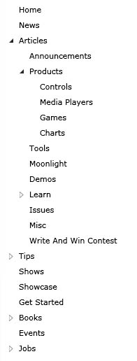
Let's start with the TreeView. You can use it whenever you want to have a tree structure. It allows you to expand and collapse sub-nodes.
XAML:
<controls:TreeView BorderThickness="0">
<controls:TreeViewItem Header="Home" />
<controls:TreeViewItem Header="News" />
<controls:TreeViewItem Header="Articles">
<controls:TreeViewItem Header="Announcements" />
<controls:TreeViewItem Header="Products">
<controls:TreeViewItem Header="Controls" />
<controls:TreeViewItem Header="Media Players" />
<controls:TreeViewItem Header="Games" />
<controls:TreeViewItem Header="Charts" />
</controls:TreeViewItem>
<controls:TreeViewItem Header="Tools" />
<controls:TreeViewItem Header="Moonlight" />
<controls:TreeViewItem Header="Demos" />
<controls:TreeViewItem Header="Learn">
<controls:TreeViewItem Header="Videos" />
<controls:TreeViewItem Header="Presentations" />
<controls:TreeViewItem Header="Tutorials" />
<controls:TreeViewItem Header="Resources" />
<controls:TreeViewItem Header="Samples" />
<controls:TreeViewItem Header="QuickStarts" />
<controls:TreeViewItem Header="Tips and Tricks" />
</controls:TreeViewItem>
<controls:TreeViewItem Header="Issues" />
<controls:TreeViewItem Header="Misc" />
<controls:TreeViewItem Header="Write And Win Contest" />
</controls:TreeViewItem>
<controls:TreeViewItem Header="Tips">
<controls:TreeViewItem Header="General" />
<controls:TreeViewItem Header="Expression Blend" />
<controls:TreeViewItem Header="Visual Studio" />
<controls:TreeViewItem Header="Tools" />
<controls:TreeViewItem Header="Styles and Templates" />
<controls:TreeViewItem Header="Binding" />
<controls:TreeViewItem Header="Resources" />
<controls:TreeViewItem Header="Controls and UI" />
<controls:TreeViewItem Header="Connectivity" />
<controls:TreeViewItem Header="Media" />
</controls:TreeViewItem>
<controls:TreeViewItem Header="Shows" />
<controls:TreeViewItem Header="Showcase" />
<controls:TreeViewItem Header="Get Started" />
<controls:TreeViewItem Header="Books">
<controls:TreeViewItem Header="Silverlight 1.0" />
<controls:TreeViewItem Header="Silverlight 2" />
<controls:TreeViewItem Header="Expression Blend" />
<controls:TreeViewItem Header="Refferences" />
<controls:TreeViewItem Header="Advanced topics" />
<controls:TreeViewItem Header="Design" />
</controls:TreeViewItem>
<controls:TreeViewItem Header="Events" />
<controls:TreeViewItem Header="Jobs">
<controls:TreeViewItem Header="Design" />
<controls:TreeViewItem Header="IT Management" />
<controls:TreeViewItem Header="Testing/QA" />
<controls:TreeViewItem Header="Development" />
<controls:TreeViewItem Header="Project Management" />
<controls:TreeViewItem Header="Other" />
</controls:TreeViewItem>
</controls:TreeView>
Its usage is as easy as defining its tree view items. You can see it in the code snippet above.
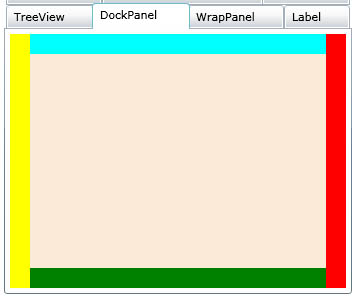
DockPanel
The DockPanel allows you to align child elements towards any of its sides: Top, Left, Bottom or Right. For more detailed description of the panel read the article of my colleague Martin Mihaylov: Using the DockPanel in Silverlight 2.
XAML:
<controls:DockPanel LastChildFill="True" HorizontalAlignment="Stretch" VerticalAlignment="Stretch">
<Rectangle controls:DockPanel.Dock="Left" Width="20" VerticalAlignment="Stretch" Fill="Yellow" ></Rectangle>
<Rectangle controls:DockPanel.Dock="Right" Width="20" VerticalAlignment="Stretch" Fill="Red" ></Rectangle>
<Rectangle controls:DockPanel.Dock="Top" HorizontalAlignment="Stretch" Height="20" Fill="Aqua"></Rectangle>
<Rectangle controls:DockPanel.Dock="Bottom" HorizontalAlignment="Stretch" Height="20" Fill="Green"></Rectangle>
<Rectangle Fill="AntiqueWhite"></Rectangle>
</controls:DockPanel>
You only have to specify the child's DockPanel.Dock attached property and that's all. Interesting property of the DockPanel is the LastChildFill. When set to true the last child of the DockPanel fills up all the available space. You shouldn't set Width and Height to that child in order to achieve this effect.
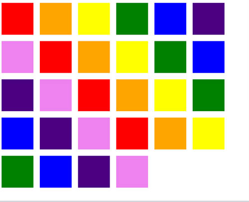
WrapPanel
The WrapPanel is useful when you want an inline alignment of child elements. Every next child stays to the right of the previous but whenever there is no space in the parent container the elements go on the next line.
XAML:
<controls:WrapPanel HorizontalAlignment="Stretch" VerticalAlignment="Stretch">
<Rectangle Width="100" Height="100" Margin="10" Fill="Red"></Rectangle>
<Rectangle Width="100" Height="100" Margin="10" Fill="Orange"></Rectangle>
<Rectangle Width="100" Height="100" Margin="10" Fill="Yellow"></Rectangle>
<Rectangle Width="100" Height="100" Margin="10" Fill="Green"></Rectangle>
<Rectangle Width="100" Height="100" Margin="10" Fill="Blue"></Rectangle>
<Rectangle Width="100" Height="100" Margin="10" Fill="Indigo"></Rectangle>
<Rectangle Width="100" Height="100" Margin="10" Fill="Violet"></Rectangle>
</controls:WrapPanel>
Note that you can also make the elements arrange vertically using the Orientation property.
I really didn't get the idea of those three following controls:
Label
The Label control can be used like the TextBlock. You can set its FontSize, FontStyle, Foreground color, FontWeight, FontFamily, etc. You can also set some other properties that do not exist in the TextBlock: Background brush, BorderBrush. In difference with the TextBlock the Label has a Content property instead of Text so you can nest any controls in it. All this can be achieved with a Border and a combination of other controls in it.

XAML:
<controls:Label
Background="Yellow"
Foreground="Green"
BorderBrush="Black"
BorderThickness="2"
Content="Label Example"
FontSize="40"
FontStyle="Italic"
FontWeight="Bold"
FontFamily="Times New Roman"
HorizontalAlignment="Center"
VerticalAlignment="Center"
Padding="10">
</controls:Label>
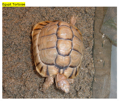
HeaderedContentControl
This is container control with header and content.
XAML:
<controls:HeaderedContentControl BorderBrush="Black" BorderThickness="2" HorizontalAlignment="Center" VerticalAlignment="Center">
<controls:HeaderedContentControl.Header>
<Grid Background="Yellow" HorizontalAlignment="Stretch">
<TextBlock Text="Egypt Tortoise"></TextBlock>
</Grid>
</controls:HeaderedContentControl.Header>
<controls:HeaderedContentControl.Content>
<Grid>
<Image Source="http://terraristic.net/photos/Testudo_kleinmanni/Testudo_kleinmanni_1.jpg"></Image>
</Grid>
</controls:HeaderedContentControl.Content>
</controls:HeaderedContentControl>
You can see in the code snippet that the Grid in the Header of the control has HorizontalAlignment set to stretch. I don't see any effect of setting this property. In my opinion the expected behavior was to make the yellow background of the header as wide as the content. You may have also noticed that I wanted to put a Border to the control. No effect. It seems that there are more limitations than features. And maybe its only purpose is to be a base for other controls.
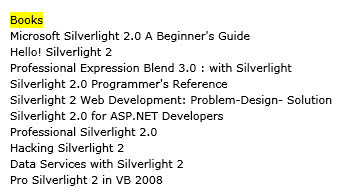
HeaderedItemsControl
Another container control with header and items collection. The limitations mentioned in the HeaderedContentControl are valid also here. Here is a little example:
XAML:
<controls:HeaderedItemsControl BorderBrush="Black" BorderThickness="2" x:Name="headeredItemsControl" HorizontalAlignment="Center" VerticalAlignment="Center">
<controls:HeaderedItemsControl.Header>
<Grid Background="Yellow" HorizontalAlignment="Stretch">
<TextBlock Text="Books"></TextBlock>
</Grid>
</controls:HeaderedItemsControl.Header>
<controls:HeaderedItemsControl.ItemTemplate>
<DataTemplate>
<TextBlock Text="{Binding}"></TextBlock>
</DataTemplate>
</controls:HeaderedItemsControl.ItemTemplate>
</controls:HeaderedItemsControl>
Code behind:
this.headeredItemsControl.ItemsSource = new string[] {
"Microsoft Silverlight 2.0 A Beginner's Guide",
"Hello! Silverlight 2",
"Professional Expression Blend 3.0 : with Silverlight",
"Silverlight 2.0 Programmer's Reference",
"Silverlight 2 Web Development: Problem-Design- Solution",
"Silverlight 2.0 for ASP.NET Developers",
"Professional Silverlight 2.0",
"Hacking Silverlight 2",
"Data Services with Silverlight 2",
"Pro Silverlight 2 in VB 2008"};
You can use any IEnumerable collection as an ItemsSource. You only have to specify the property's name in the binding syntax of the controls in the DataTemplate.
AutoCompleteBox
A nice text input control providing auto-complete functionality:

XAML:
<controls:AutoCompleteBox SearchMode="StartsWith" x:Name="autoCompleteBox" Width="200" HorizontalAlignment="Center" VerticalAlignment="Center">
</controls:AutoCompleteBox>
Code behind:
this.autoCompleteBox.ItemsSource = new string[] {
"Silverlight",
"Silverlight News",
"Silverlight Articles",
"Silverlight Tips",
"Silverlight Shows",
"Silverlight Showcase",
"Silverlight Books",
"Silverlight Events",
"Silverlight Jobs"
};
You are setting the ItemsSource and you are ready. One property I should mention is the SearchMode. It specified how the string you've typed should be searched in the ItemsSource collection. Note that you have a Custom option. So obviously you have the option to define yourself how control should search in the collection when you are typing.
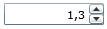
NumericUpDown
This kind of control is so common in both Windows and web applications so it does not need a description. We are happy that we have it in Silverlight:
XAML:
<input:NumericUpDown Width="100" DecimalPlaces="1"
Increment="0.1" Minimum="0"
Maximum="10" Value="1.25">
</input:NumericUpDown>
All you need is to set its Minimum and Maximum values, the Increment and the DecimalPlaces according to your needs and you are done.
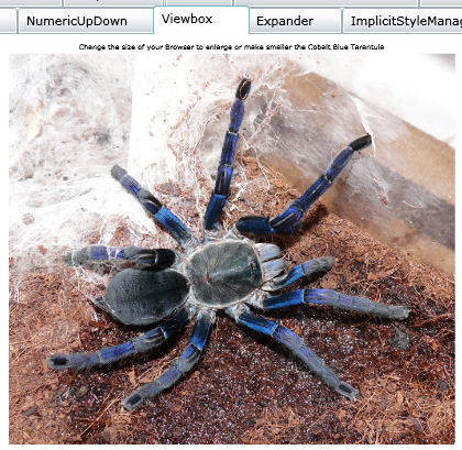
Viewbox
An interesting control that stretches its child control in order to fill the available space.
XAML:
<controls:Viewbox>
<Grid>
<Grid.RowDefinitions>
<RowDefinition Height="auto"></RowDefinition>
<RowDefinition Height="*"></RowDefinition>
</Grid.RowDefinitions>
<Grid.ColumnDefinitions>
<ColumnDefinition></ColumnDefinition>
</Grid.ColumnDefinitions>
<TextBox Grid.Row="0" Grid.Column="0" HorizontalAlignment="Center" BorderThickness="0"
Text="Change the size of your Browser to enlarge or make smaller the Cobalt Blue Tarantula">
</TextBox>
<Image Grid.Row="1" Grid.Column="0" Source="http://xn--h1aafk.com/pets/Haplopelma_lividum/Haplopelma_lividum_1.jpg"></Image>
</Grid>
</controls:Viewbox>
Note that you can put another container control as a child of the ViewBox so all of the nested controls will be resized.
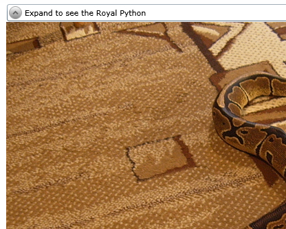
Expander
Allows showing and hiding content with single button click. It's quite a common scenario.
XAML:
<controls:Expander Width="700" HorizontalAlignment="Center" VerticalAlignment="Top">
<controls:HeaderedContentControl.Header>
<TextBlock Text="Expand to see the Royal Python"></TextBlock>
</controls:HeaderedContentControl.Header>
<controls:HeaderedContentControl.Content>
<Image Source="http://terraristic.net/photos/Python_regius/Python_regius_1.jpg"
HorizontalAlignment="Center" VerticalAlignment="Center">
</Image>
</controls:HeaderedContentControl.Content>
</controls:Expander>
As it seems it inherits the HeaderedContentControl but looks pretty good.
ImplicitStyleManager
The ImplicitStyleManager allows you to easily set styles to several Silverlight controls by only setting the path to the ResourceDictionary to their parent control.
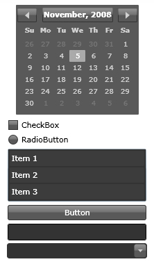
XAML:
<StackPanel
theming:ImplicitStyleManager.ResourceDictionaryUri="/SilverlightToolKitSample;component/Themes/ExpressionDark.xaml"
theming:ImplicitStyleManager.ApplyMode="Auto"
Width="200"
Grid.Row="0" Grid.Column="0">
<basics:Calendar></basics:Calendar>
<Rectangle Height="5"></Rectangle>
<StackPanel Orientation="Horizontal" >
<CheckBox></CheckBox>
<TextBlock Text="CheckBox"></TextBlock>
</StackPanel>
<Rectangle Height="5"></Rectangle>
<StackPanel Orientation="Horizontal" >
<RadioButton></RadioButton>
<TextBlock Text="RadioButton"></TextBlock>
</StackPanel>
<Rectangle Height="5"></Rectangle>
<ListBox>
<ListBox.Items>
<ListBoxItem Content="Item 1"></ListBoxItem>
<ListBoxItem Content="Item 2"></ListBoxItem>
<ListBoxItem Content="Item 3"></ListBoxItem>
</ListBox.Items>
</ListBox>
<Rectangle Height="5"></Rectangle>
<Button Content="Button"></Button>
<Rectangle Height="5"></Rectangle>
<TextBox></TextBox>
<Rectangle Height="5"></Rectangle>
<ComboBox>
<ComboBox.Items>
<ComboBoxItem Content="Item 1"></ComboBoxItem>
<ComboBoxItem Content="Item 2"></ComboBoxItem>
<ComboBoxItem Content="Item 3"></ComboBoxItem>
</ComboBox.Items>
</ComboBox>
</StackPanel>
You are just setting the ResourceDictionaryUri and the ApplyMode attached properties and your styles are applied to your controls. In this example I used the Expression Dark theme shipped with the Silverlight Toolkit. The strange thing for me is the path syntax:
/<project name>;component/<path to the xaml file>
In our case: /SilverlightToolKitSample;component/Themes/ExpressionDark.xaml
I tried to just give the path to the XAML file since it was in the same project but it didn't work.
Charting
There are 5 kinds of charts included in the Silverlight Toolkit: Column, Bar, Line, Scatter and Pie. I'll give an example for every one of them.
Column chart
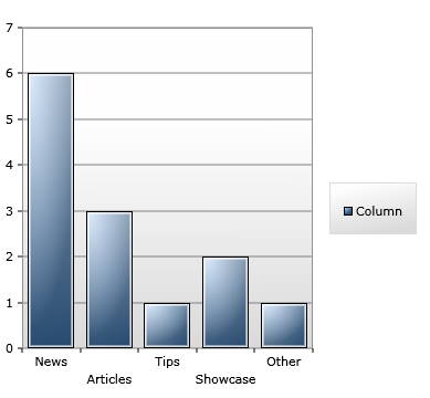
XAML:
<charting:Chart x:Name="chartColumn" Grid.Row="0" Grid.Column="0">
<charting:Chart.Series>
<charting:ColumnSeries
Title="Column"
DependentValueBinding="{Binding Value}"
IndependentValueBinding="{Binding Key}" />
</charting:Chart.Series>
</charting:Chart>
Code behind:
( ( ColumnSeries )this.chartColumn.Series[ 0 ] ).ItemsSource = new KeyValuePair<string, int>[]
{
new KeyValuePair<string,int>("News", 6),
new KeyValuePair<string,int>("Articles", 3),
new KeyValuePair<string,int>("Tips", 1),
new KeyValuePair<string,int>("Showcase", 2),
new KeyValuePair<string,int>("Other", 1)
};
Bar chart
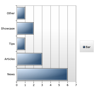
XAML:
<charting:Chart x:Name="chartBar" Grid.Row="1" Grid.Column="0">
<charting:Chart.Series>
<charting:BarSeries
Title="Bar"
DependentValueBinding="{Binding Path=Value}"
IndependentValueBinding="{Binding Path=Key}">
</charting:BarSeries>
</charting:Chart.Series>
</charting:Chart>
Code behind:
( ( BarSeries )this.chartBar.Series[ 0 ] ).ItemsSource = new KeyValuePair<string, int>[]
{
new KeyValuePair<string,int>("News", 6),
new KeyValuePair<string,int>("Articles", 3),
new KeyValuePair<string,int>("Tips", 1),
new KeyValuePair<string,int>("Showcase", 2),
new KeyValuePair<string,int>("Other", 1)
};
Line chart
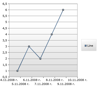
XAML:
<charting:Chart x:Name="chartLine" Grid.Row="0" Grid.Column="2">
<charting:Chart.Series>
<charting:LineSeries
Title="Line"
DependentValueBinding="{Binding Path=Value}"
IndependentValueBinding="{Binding Path=Key}">
</charting:LineSeries>
</charting:Chart.Series>
</charting:Chart>
Code behind:
( ( LineSeries )this.chartLine.Series[ 0 ] ).ItemsSource = new KeyValuePair<DateTime, int>[]
{
new KeyValuePair<DateTime,int>(DateTime.Now, 1),
new KeyValuePair<DateTime,int>(DateTime.Now.AddDays(1), 3),
new KeyValuePair<DateTime,int>(DateTime.Now.AddDays(2), 2),
new KeyValuePair<DateTime,int>(DateTime.Now.AddDays(3), 4),
new KeyValuePair<DateTime,int>(DateTime.Now.AddDays(4), 6)
};
Scatter chart
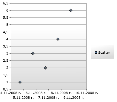
XAML:
<charting:Chart x:Name="chartScatter" Grid.Row="1" Grid.Column="2">
<charting:Chart.Series>
<charting:ScatterSeries
Title="Scatter"
DependentValueBinding="{Binding Path=Value}"
IndependentValueBinding="{Binding Path=Key}">
</charting:ScatterSeries>
</charting:Chart.Series>
</charting:Chart>
Code behind:
( ( ScatterSeries )this.chartScatter.Series[ 0 ] ).ItemsSource = new KeyValuePair<DateTime, int>[]
{
new KeyValuePair<DateTime,int>(DateTime.Now, 1),
new KeyValuePair<DateTime,int>(DateTime.Now.AddDays(1), 3),
new KeyValuePair<DateTime,int>(DateTime.Now.AddDays(2), 2),
new KeyValuePair<DateTime,int>(DateTime.Now.AddDays(3), 4),
new KeyValuePair<DateTime,int>(DateTime.Now.AddDays(4), 6)
};
Pie chart

XAML:
<charting:Chart x:Name="chartPie" Grid.Row="0" Grid.Column="1">
<charting:Chart.Series>
<charting:PieSeries
DependentValueBinding="{Binding Path=Value}"
IndependentValueBinding="{Binding Path=Key}">
</charting:PieSeries>
</charting:Chart.Series>
</charting:Chart>
Code behind:
( ( PieSeries )this.chartPie.Series[ 0 ] ).ItemsSource = new KeyValuePair<string, int>[]
{
new KeyValuePair<string,int>("News", 6),
new KeyValuePair<string,int>("Articles", 3),
new KeyValuePair<string,int>("Tips", 1),
new KeyValuePair<string,int>("Showcase", 2),
new KeyValuePair<string,int>("Other", 1)
};
The important thing about every kind of chart is to define its corresponding Series with IndependentValueBinding and DependentValueBinding. And of course to specify an ItemsSource for the Series. I gave the easiest example with KeyValuePair array but you can specify any IEnumerable collection and define your own classes for the items.
Conclusion
In conclusion I want to thank the people who created this set of great controls and gave it to us. I still can't understand the use of some of the controls, but as I like to say, the problem is probably in me. Stay tuned and expect more detailed article about each one of the controls included in the set.